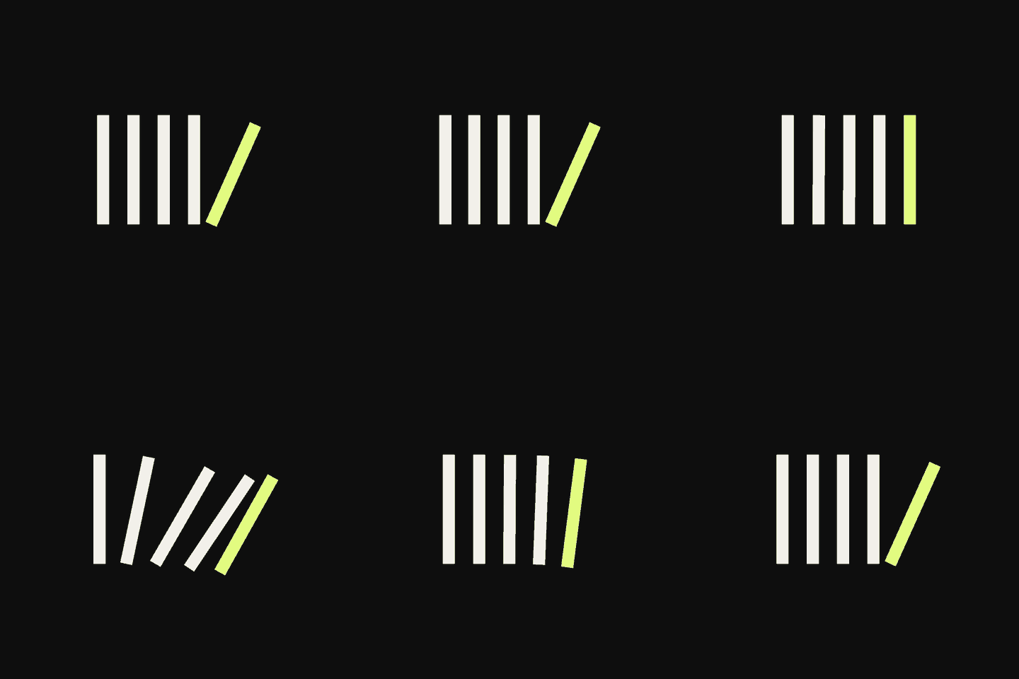
01 · Link
The underline redraws, the arrow steps forward. The line wipes away and comes back thicker, so a link never depends on colour alone. Nav links have no resting line; it draws in from the left.
A brand system made of bars
A toolmaker for brands and businesses. Identity, websites, automation, AI agents, promotion, built as tools you own.
Quick question before we start: why are you here?
Why we exist
We could sell you a retainer.
We'd rather you didn't need us.
The agency model rents you its brain, by the month, forever. We think that's backwards. Companies don't need more services. They need tools: built for their problem, handed over with a manual, owned completely.
Numbers, not vibes. Each bar is the number.
The atom
Every piece of this brand is made of one thing: a bar, exactly 1 Seriousness thick. No symbol, no mascot, no swoosh. The bar is a tool. What it means depends on how you arrange it, which is what we do for companies too.
Drag the bar, or use the ← → keys
Choose your route
A website should behave like a good tool: it adapts to the person holding it. Pick what you care about, and we'll rearrange everything below.
No door chosen. Default route: system → tools → play.
Stripe grammar
We don't have a logo. We have a grammar. Five bars rearrange into glyphs, and every glyph means something. It's the same five bars every time. Watch them move. Nothing is added and nothing is lost: it's only rearranged.
Standby
The master mark
A flexible system still needs one form that never changes. Ours is Standby: four bars at rest and one already tipping. It is the first frame of the Fall animation. Our logo is literally a tool, a split second before it does its job.
Click it five times. We dare you.


The mark, in motion
Four bars stay.
One steps back.
Twelve seconds, six beats. Our enemies first, dependency and black boxes, then crossed out. Then how we win: one push, and it runs. Then the point: the four upright bars are your tools, standing on their own. The fifth bar, the tipping one, is us, stepping back. That's why the logo looks like that.
Tape & code
When a bar carries words, it becomes tape. Tape marks what is happening right now: news, warnings, and work in progress. It always runs edge to edge, because voice shouldn't be boxed in.
Any word becomes a stripe signature: the same input always gives the same bars. Every client, project and person gets one, and it's the same tomorrow as today.
Colour
Four core colours do the daily work. Each tool gets its own accent, like coloured handles in a toolbox, so you always know which tool you're holding. Rule: one loud field per composition.
Imagery
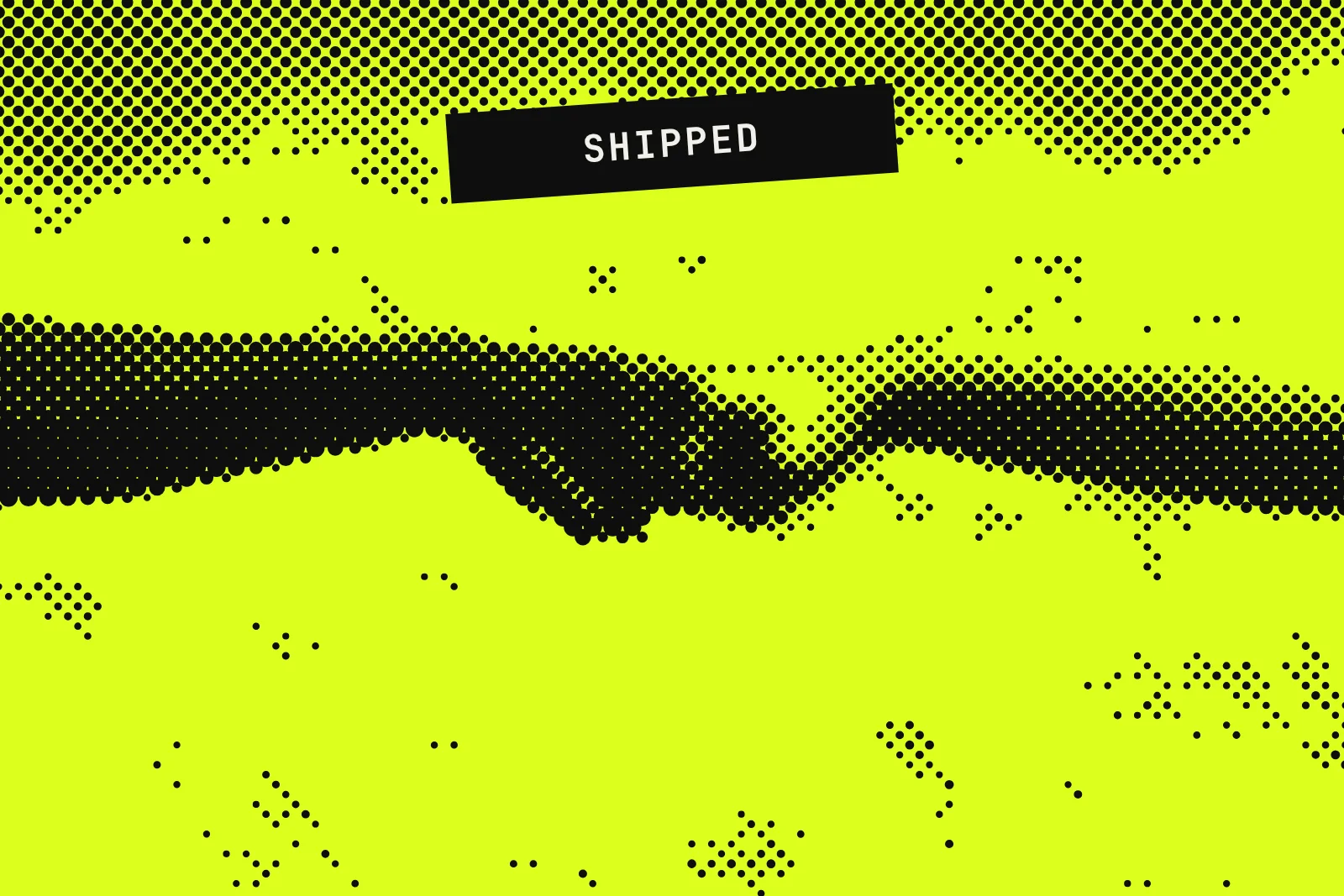
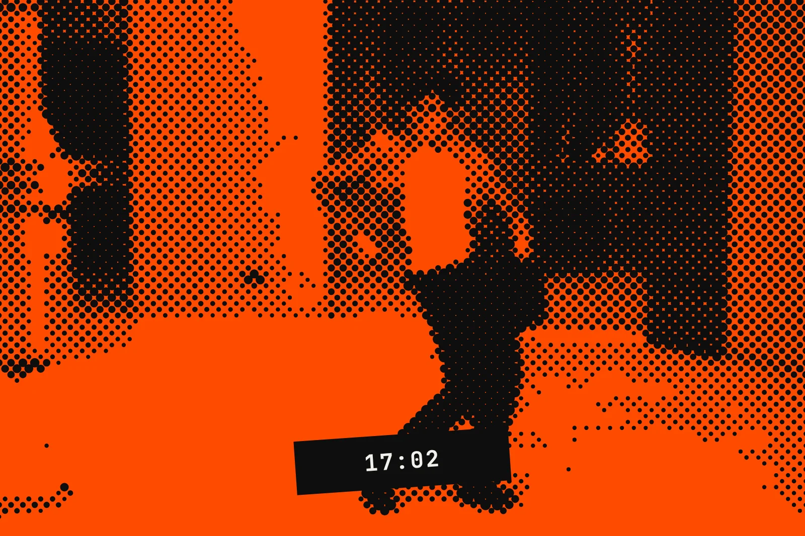
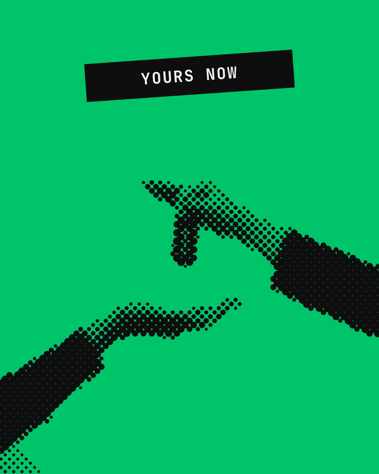
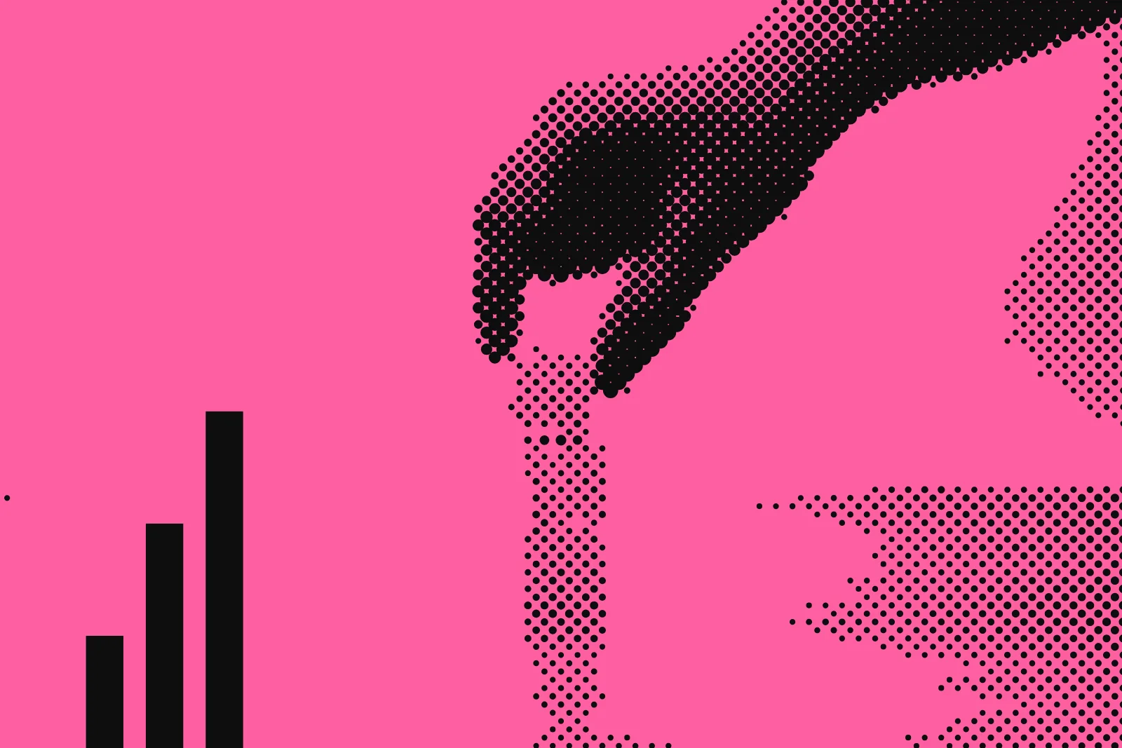
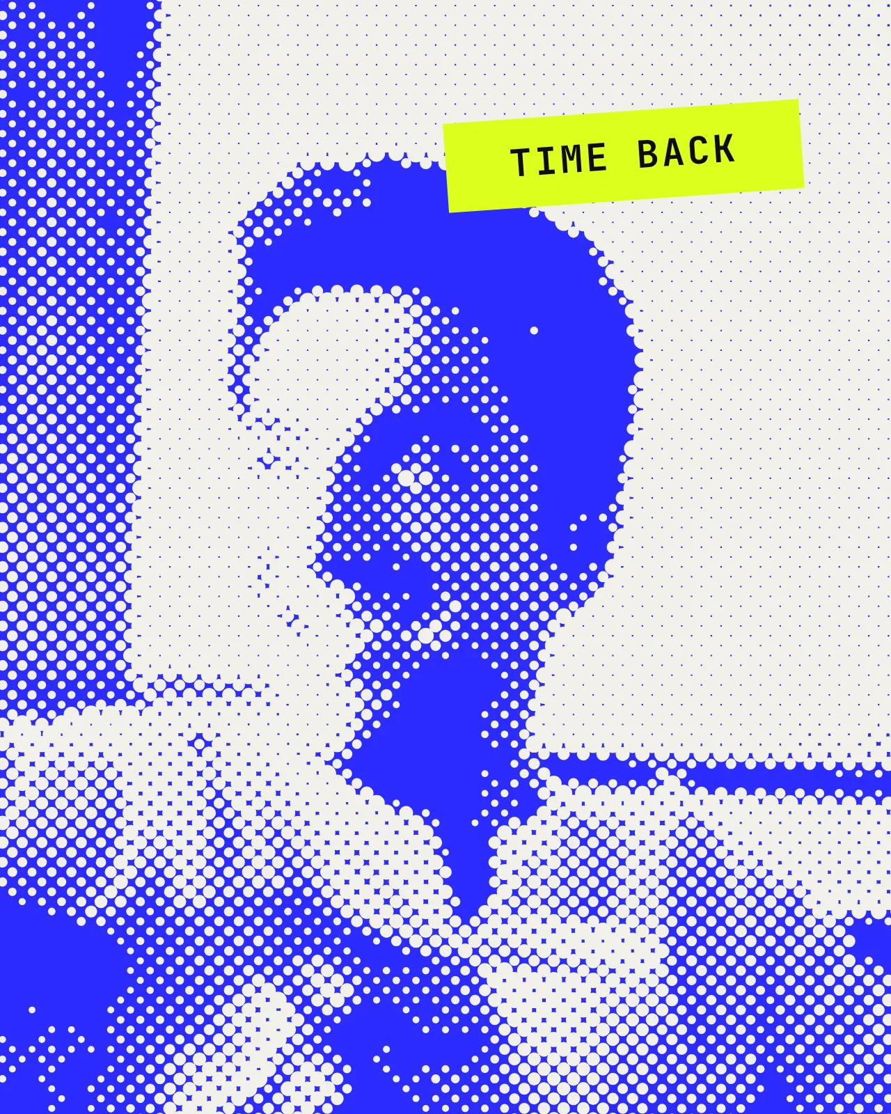
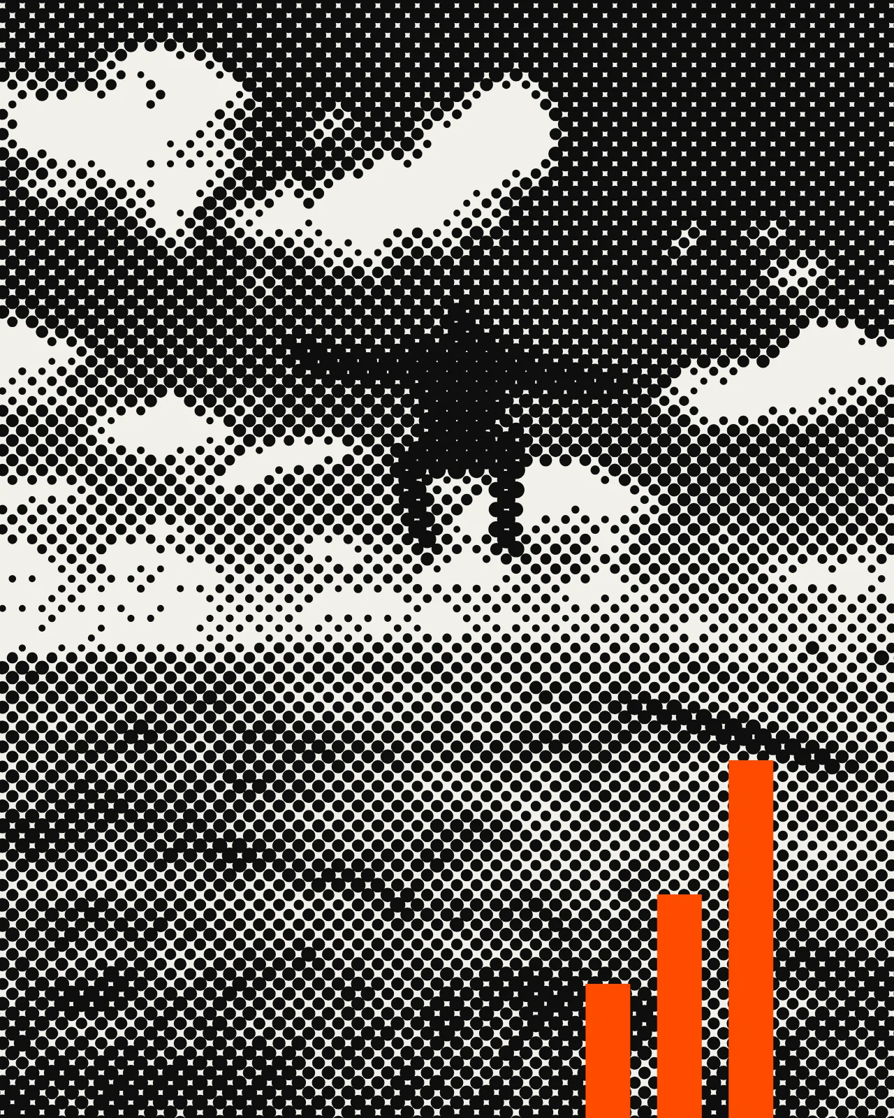
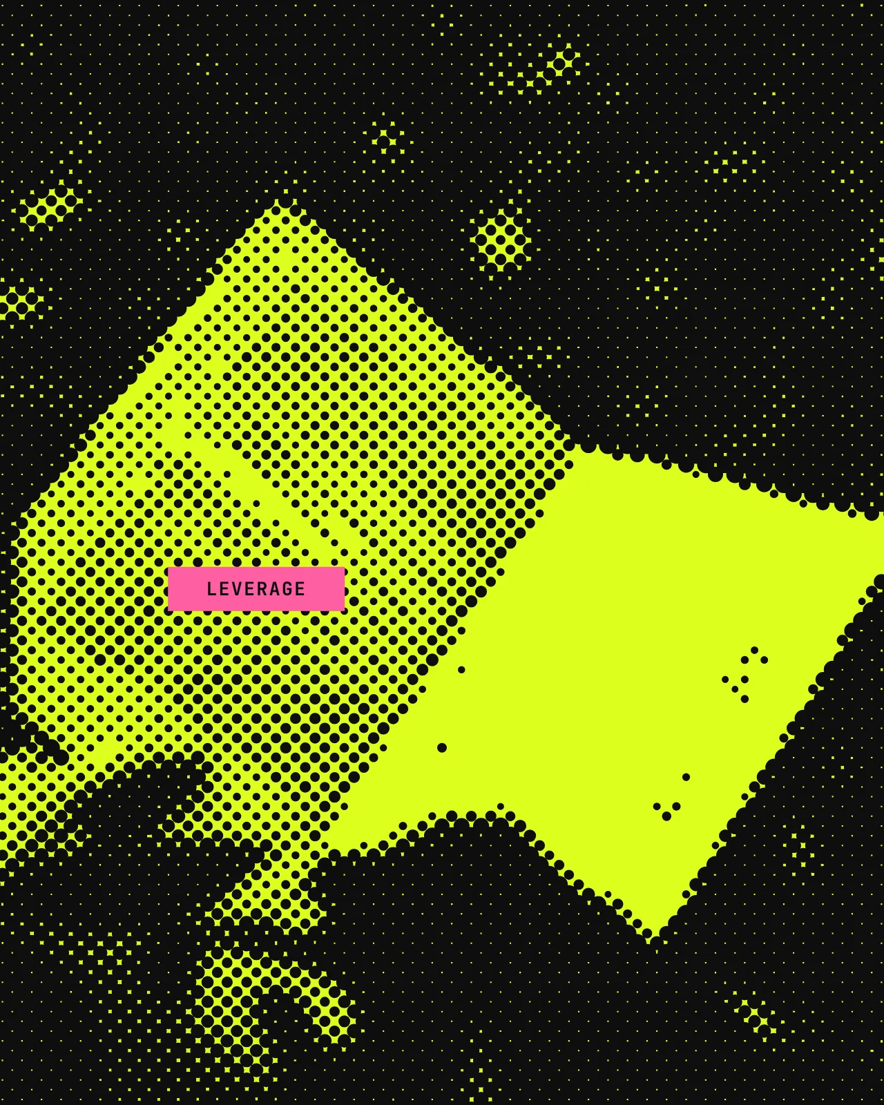
Our pictures show the moment after the tool works: the evening back, the keys handed over, the fist bump nobody scheduled. One loud colour, one ink, clean dots. The bar joins in like a colleague with a sense of humour, never like a warning sign.
The four jobs
Retired 2026-11-01: Cross and Standby. A bar slashing through a photo, or leaning alone at the edge, read like a mourning ribbon.
The treatment, as a tool
The same engine that made the pictures above. Grayscale, levels, a clean halftone screen, one ink on one loud colour, one bar with a job. Drag the bar to place it. Export a PNG with the credit strip attached.
No photo yet
Photo
Your photo never leaves this tab. No upload, no server, no copy. It's read by your browser and forgotten when you close it.
Job
Accent
Ground
Screen
Canvas focused: arrows move · shift = faster · + / − length
Photos via Unsplash, used under the Unsplash License and treated by us. Photographers credited on each figure, because it's their work.
Typography
Our typeface is Fixel, made by MacPaw and the Ukrainian type foundry AlfaBravo. It's named after Fixel, the first of MacPaw's cats, who inspired its shape and personality.
Fixel is a geometric grotesk with a humanist streak: open letterforms, crisp edges and low contrast. Precise, but never cold. It covers more than 40 languages, including a complete Ukrainian Cyrillic, and it carries a set of traditional Ukrainian symbols drawn from folk art and Heorhiy Narbut's graphics.
MacPaw gives it away for free under the Open Font License, commercial use included, and asks only for an optional donation to the MacPaw Foundation, which supports people in Ukraine. A tool, built well, handed over, owned by everyone who uses it. That's our whole business model in a font file. We couldn't have drawn a better fit.
fixel.macpaw.com ↗ · OFL 1.1 on GitHub ↗ · MacPaw Foundation ↗
Stop waiting. Start working.
Display
Fixel
Fixel · width 75 · weight 850 · caps · leading 0.88
Text
Fixel, plain and useful.
Fixel · width 100 · weight 400–500 · leading 1.45
Labels
VST-02 / 03:14 / OK
JetBrains Mono · 11–13 px · caps · spec-sheet voice
Tone of voice
Agency → Human translator
Motion
Five motion verbs, each with a meaning. No decorative wiggling and no bouncing logos. Hover or focus a card to run it.
Interaction
We sell tools, so the website behaves like one. Every link, label and picture reacts to you, each in its own way and for a reason. Try them. Seriousness "very" or reduced motion turns the movement off; the cues stay.
01 · Link
The underline redraws, the arrow steps forward. The line wipes away and comes back thicker, so a link never depends on colour alone. Nav links have no resting line; it draws in from the left.
02 · Button
Hard shadow on hover, pressed flat on click. Like a real key: it lifts toward you, then goes down. No soft glows, no gradients.
03 · Kicker
Problem → tool → handover
The measuring bar extends, the words decode from bars. Small labels arrive like a reading on a gauge (CODE behaviour). Screen readers get the plain text at once.
04 · Glyph
Hover re-assembles the bars; a click gives them the next job. Same five bars, different job. The hero mark also leans toward the cursor and steps back as you scroll.
05 · Tape
Very seriously.
Tape slaps on last and peels at one corner on hover. The tape word is the punchline of a headline; it sticks back when you leave it.
06 · Selection
Select a few words of this sentence and watch the tape.
Selecting text lays signal tape over it. Acid behind, a strip of signal on top, slightly crooked, like a highlighter used with conviction. Works on every page.
07 · VST/SAYS
A narrator tape at the bottom comments on what you do. One line at a time, dry and kind: on arrival, per section, when you idle, scroll back or come back to the tab. Mute is remembered only after a click.
08 · Portrait
People move a little; bars stand beside them as tools. The halftone is redrawn live: the head and its shadow turn as you scroll, the dots lighten under the cursor. Three bars (Build, Manual, Leave) lean toward you, rise on hover and step back when clicked.
09 · Free tool
Tools on the site are real and keep nothing. Answers update as you type; the state lives in the link, so it can be shared and nothing is stored. The honest answer is allowed to be "keep doing it by hand".
10 · Logo and header
The header mark fills as you read; its bars hop when you point at it. In the footer the logo plays like an equaliser and a click knocks the bars over, domino-style, back to the top.
The full list, with timings and the rules for reduced motion, lives in the repo: docs/interaction-patterns.md.
Applications
A brand only exists where people touch it. Type a name and every object below rebuilds itself with your bars.
Best,
P.S. You keep everything. Including this email.
Brand kit
Take the bars home.
Every glyph as an SVG, plus colour and type tokens as CSS and JSON. Same files we use. No login, no form, no "request access".
Paper with a job.
Eight pieces, each one used at a real moment: the first meeting, the kickoff workshop, handover day. All are print-ready PDFs with 3 mm bleed. They're RGB: your printer converts them, and the colour values in the specs are approximations until a printer proofs them on paper. Specs are in brand-assets/print/SPECS.md.
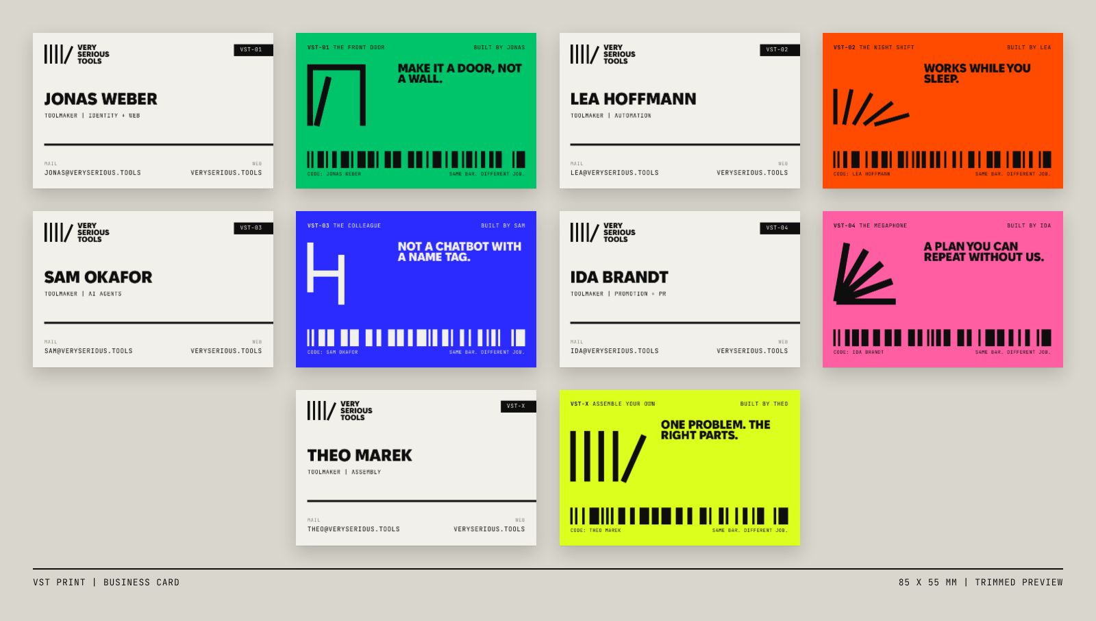
85 × 55 mm + 3 mm bleed
Hands over a name and an inbox; the back carries the tool the person builds, so the card explains the company in one glance.
PDF · print-ready ↓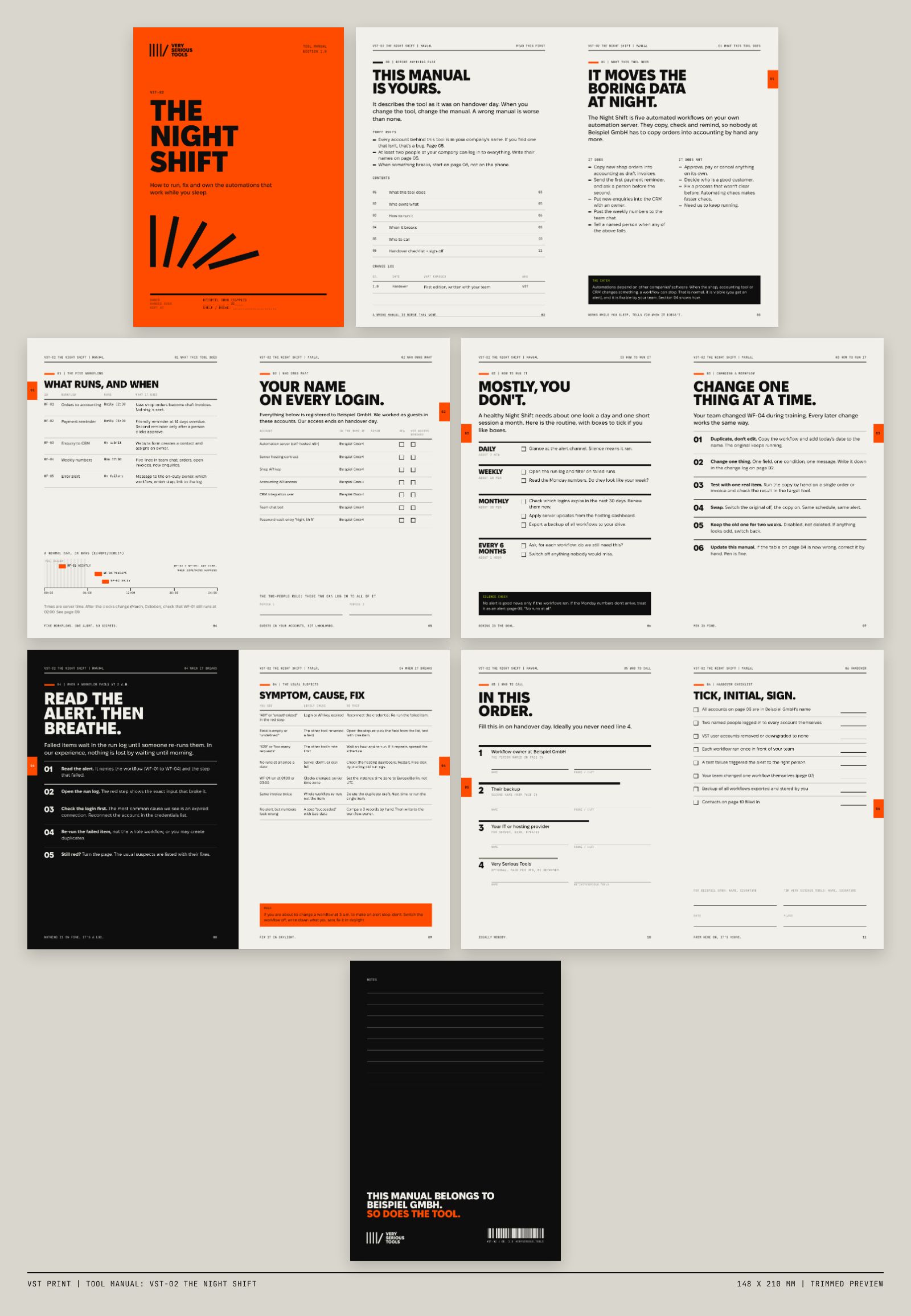
148 × 210 mm + 3 mm bleed
Ships with every tool so the client can run it, fix it and sign for it without calling us.
PDF · print-ready ↓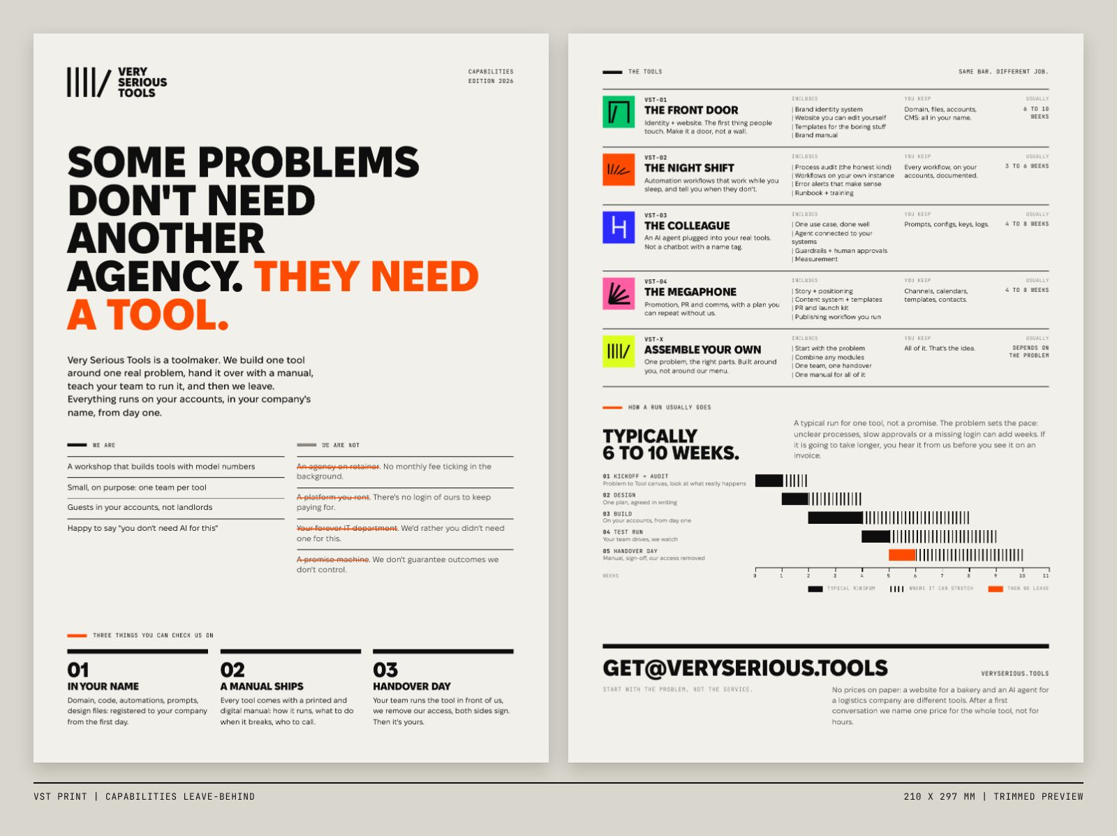
210 × 297 mm + 3 mm bleed
Left on the table after a first meeting: what we are, what we are not, the five tools and how a run usually goes.
PDF · print-ready ↓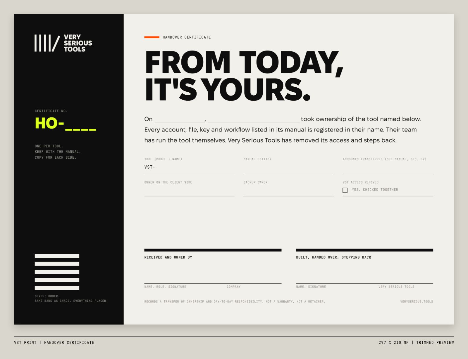
297 × 210 mm + 3 mm bleed
Signed on Handover Day: the documented moment the client takes ownership of the tool and every account behind it.
PDF · print-ready ↓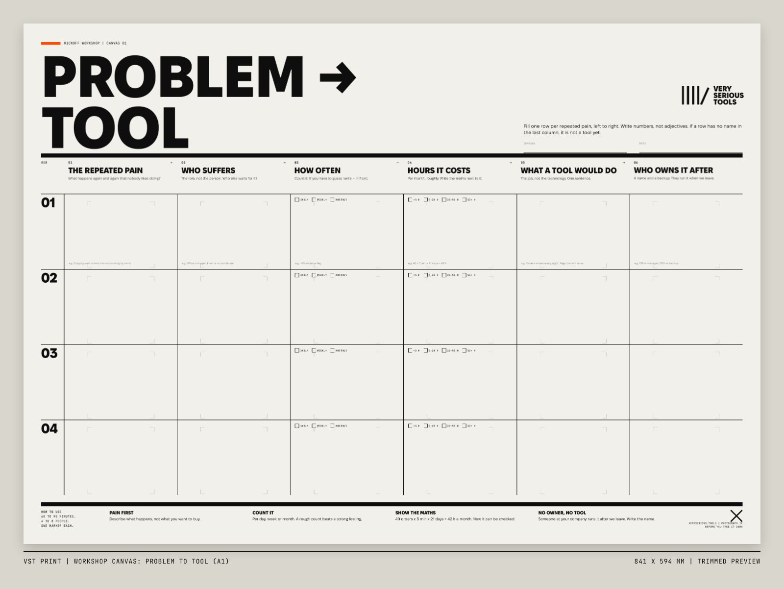
841 × 594 mm + 3 mm bleed
Goes on the wall at kickoff: maps a repeated pain to who suffers, how often, the hours it costs, the tool and its future owner.
PDF · print-ready ↓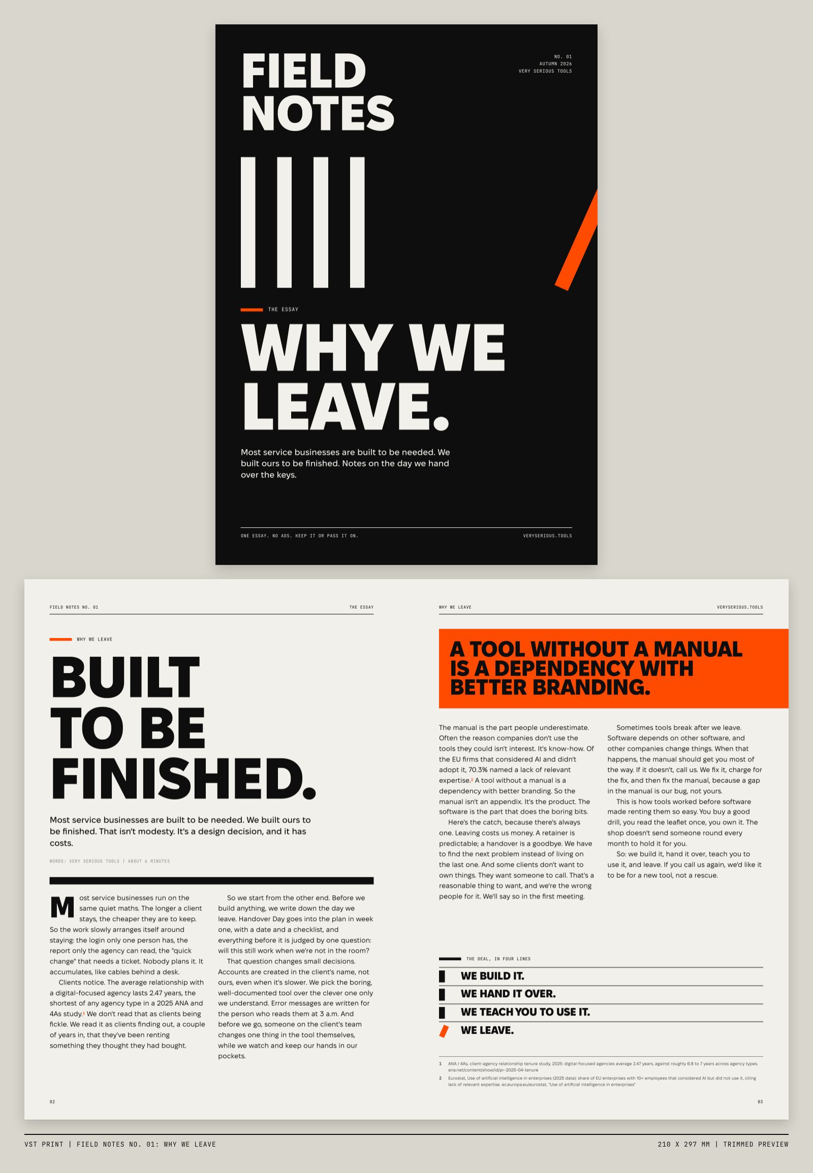
210 × 297 mm + 3 mm bleed
A short printed essay that explains the business model honestly; mailed or left with people who asked "so what happens after?"
PDF · print-ready ↓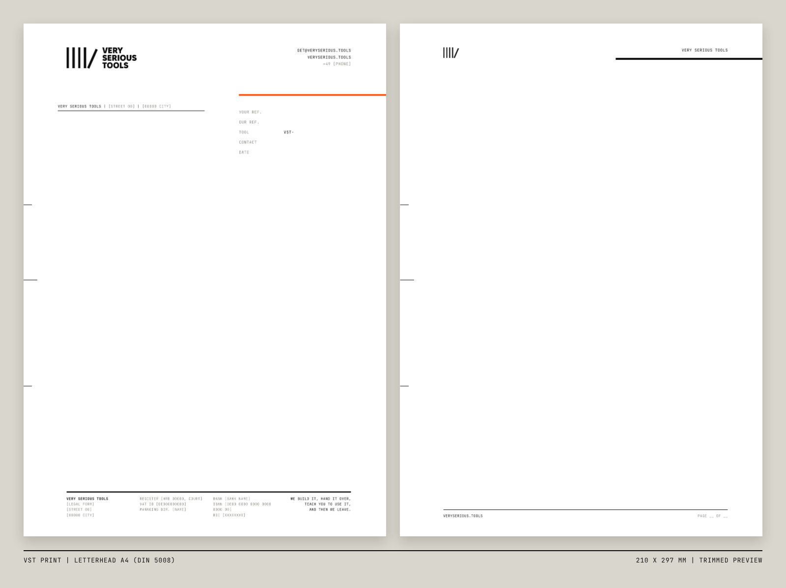
210 × 297 mm + 3 mm bleed
For quotes, contracts and handover letters; window-envelope ready (DIN 5008 Form B) with fold and punch marks.
PDF · print-ready ↓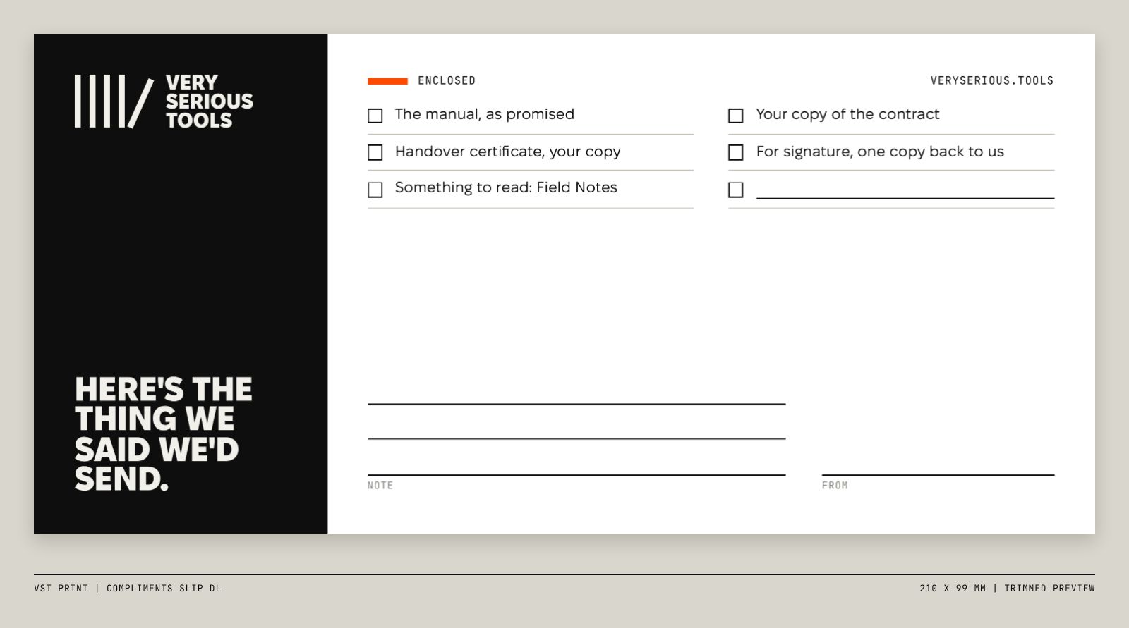
210 × 99 mm + 3 mm bleed
Rides along with anything physical we send (manual, signed contract, keys) and says why it is in the envelope.
PDF · print-ready ↓The tools
A tool is a combination of whatever your problem needs: a website plus identity, automation plus an AI agent, anything. Each one ships with a manual, runs on your accounts, and is yours on Handover Day.
How it works
One problem, described honestly. We find out what hurts, not what's trendy.
We build the tool on your accounts, in your name, in weeks, not quarters.
Manual, training, keys. Your team runs it while we watch, not the other way round.
We step back, your team runs it. If you call again, it's for a new tool, not a rescue.
Fire your agency.
Including us, eventually.
Fair questions
Most agencies hope you won't ask these. We'd rather you did.
VST-X · Assemble your own
Free toolbox
Four small tools. Everything runs in your browser, nothing is uploaded and nothing is stored. Download the result and post it. You promote yourself, and we get a tiny barcode in the corner. That's fair.
Same name, same bars. Forever. That's the CODE behaviour.
Wrapped the page? Click a tape to tear it off. Therapeutic.